While they have always played a pivotal role in business success, the terms ‘data report’ or ‘business report’ haven’t exactly been synonymous with creativity or innovation. Data reporting and analysis is often seen as a necessary evil created by analysts and consultants to offer functional operational insights.
As such, the term usually conjures up images of static PDFs, old-school PowerPoint slides, and big tables. Usually created with past data without any room for generating real-time or predictive insights, static reports were deemed obsolete, consisting of numerous external and internal files, without proper information management processes at hand.
But in the digital age, it doesn’t have to be this way. In fact, the business intelligence industry has evolved enormously over the past decade, and data analytics reports are riding the crest of this incredible technological wave.
The rise of innovative report tools means you can create report insights that people are compelled to read and that will offer a wealth of business-boosting value. If you utilize business intelligence correctly, not only will you be able to connect your informational dots, but take control of your data across the company and improve your bottom line.
Here, we will consider the question, ‘what is a data report?’, explore how to generate one, and provide the best possible data reports examples, all created with modern software. Without further ado, let’s get started!
What Is a Data Report?
A data report is an analytical tool used to extract past, present, and future performance insights to accelerate a company’s growth. It combines various sources of information and is usually used both on an operational and strategic level of decision-making.
As mentioned, these reports had features of static presentation of data, manually written or calculated, but with the introduction of modern processes such as dashboard reporting, they have developed into an invaluable resource to successfully manage your sales processes, marketing data, and even robust manufacturing analytics and numerous other organizational processes needed to stay on top of the pack.
But let’s get into the basics in more detail, and afterward, we will explore data reporting examples that you can use for your own internal processes and more.
Data Reporting Basics
We’ve explored the data report definition – now, we’re going to look at the essential reports and data fundamentals: the building blocks of business intelligence success.
Purpose: Data analytics is the art of curating and analyzing raw insights with the purpose of transforming metrics into actionable insights. Data analytics reports present metrics, analyses, conclusions, and recommendations in an accessible, digestible visual format so everyone in an organization can make informed data-driven decisions.
Data types: Business data reports cover a variety of topics and organizational functions. As such, all data report types vary greatly in length, content, and format. It’s possible to present reporting data as an annual report, monthly sales report, accounting report, reports requested by management exploring a specific issue, reports requested by the government showing a company’s compliance with regulations, progress reports, feasibility studies, and more. The all-encompassing nature of data-centric reports means it’s possible to work with a mix of historic, predictive, and in-the-moment insights to paint a panoramic picture of your organization’s functions, processes, and overall progress.
Accessibility: Historically, creating data driven reports was time- and resource-intensive. Data pull requests were the exclusive duties of the IT department, with a significant amount of effort spent analyzing, formatting, and then presenting the data. Because this task was so resource-heavy, data analysis was an occasional luxury. Also, by the time the data was presented, it was generally out of date. The emergence of real-time cloud-based BI reporting tools has changed the reporting game. Now a wider range of users can act as analysts, even performing advanced analytics. The right BI platform can blend multiple data sources into one report and analysis: enhancing organizational insights and better-informed decision-making. These cloud-based tools allow organizations to collaborate on a report, bringing various subject matter experts (SMEs) to the same table. Modern business dashboard tools allow a wider audience to comprehend and disseminate the report findings. Users can also easily export these dashboards and data visualizations into visually stunning reports that can be shared via multiple options such as automating emails or providing a secure viewer area, even embedding reports into your own application, for example.
Flexibility: In addition to the fact that data report software offers a wealth of visually-accessible KPI-driven insight, business intelligence dashboards are also completely customizable to suit individual goals or needs. Moreover, data dashboards are optimized for mobile devices, meaning that it’s possible for users to access a wealth of business-boosting information from a central display, 24/7, without restrictions or limits. You can leverage business intelligence day or night, from anywhere in the world.
Now that you understand the superior analytical capabilities of modern business data reporting, we’re going to look at a mix of tips and ideas designed to help you build and create online data reports that will save time and costs while driving innovation across the organization.
Top 14 Data Reporting Best Practices & Tips
We’ve been through the basics, so now, we’re going to look at how to create data reports from a practical perspective. That’s where our documenting data in business reports tips come into play.
Depending on the type of report, each has its own set of rules and best practices. We will mention below the most popular ones, but our main focus is on reports that will, ultimately, provide you with a roadmap on how you can make your reports more productive. Let’s get started.
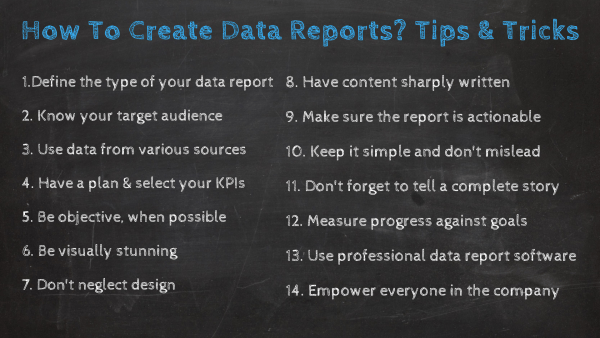
1. Define The Type Of Your Data Report
What types of data reporting do you need to present? Having this definition in advance will help set parameters you can easily stick to. Here are the most common types of data reports:
1) Informational vs. analytical: First determine if this report is just providing factual information. Informational reports are usually smaller in size, the writing structure is not strict, and the sole purpose is to inform about facts without adding any analysis. On the other hand, if it is providing any analysis, demonstrates relationships, or recommendations, it is an analytical report.
2) Recommendation/justification report: Presents an idea and makes suggestions to management or other important decision-makers. As the name suggests, it provides recommendations for changes in internal procedures and justifies courses of action that have the goal of improving business success.
3) Investigative report: Helps determine the risks involved with a specific course of action. It is based on documenting specific information objectively with the purpose of presenting enough information to stakeholders. They will ultimately decide if further actions are needed. An example would be a report created for legal purposes.
4) Compliance report: Shows accountability by providing compliance information for example to a governing body. This is particularly important as accurate, well-presented compliance metrics will avoid costly mistakes or red tape issues.
5) Feasibility report: An exploratory report to determine whether an idea will work. Data-driven insights could potentially save thousands of pounds by helping organizations avoid redundant processes or developments.
6) Research studies report: Presents in-depth research and insights on a specific issue or problem. Research is pivotal to growth and evolution and having the visual insights to back up your decisions will set you apart from the pack.
7) Periodic report: Improves policies, products, or processes via consistent monitoring at fixed intervals, such as weekly, monthly, quarterly, etc. These types of reports help foster incremental growth as well as consistency across the board.
8) KPI report: Monitors and measures key performance indicators (KPIs) to assess if your operations deliver the expected results. The best dashboards for benchmarking progress in a number of areas, both internal and external.
9) Yardstick report: Weighs several potential solutions for a given situation. An invaluable tool that you can adapt to your specific goals, aims, needs, and situations. A solution-centric tool that every modern business should embrace.
2. Know Your Target Audience
Knowing your audience will help determine which insights you present, the recommendations you make, and how you present the data. Your audience may be upper, middle or line management, other departments in the company, coworkers, the client, potential clients, the government, or another company in the same market.
Knowing your audience helps determine what type of information to include in the report. If a report is internally facing, branding such as colors, font, and logo aren’t as crucial. If it is a one-time live presentation, formatting for printing isn’t key. Determine in advance if your audience needs persuasion or education. If your audience is C-suite level or the board, you may want to present mostly high-level insights with specific call-outs and action items.
If the report is more exploratory in nature, you may want to include more granular information and options to interact with the data. Ramon Ray, tech evangelist and founder of Smart Hustle Magazine, wrote about how to best present your data to a wide audience. He focused on keeping text simple, using visualizations whenever possible, including video and animation when appropriate, and making your reports/presentations interactive. Knowing your audience before you start your analysis – and even more importantly before you put together the report – will keep everything data-focused and impactful.
3. Use Data From Various Sources
Once you understand the questions you want to answer with your reports as well as your audience, you will need to determine which sources of data you will use to generate your reports. With the use of data becoming a regular part of businesses’ daily activities, so has grown the amount of internal and external sources from which companies are extracting the data. When building your reports, it can get overwhelming to decide which information to use and how to make sure that everything is clean and optimized to be used. This can be done with the help of data connectors.
Among some of the many BI features in the market today, datapine offers professional data connectors that allow you to connect flat files, social media data, APIs, CRM data, and several other sources with just a few clicks. And not just that, once your sources are connected, the tool automatically updates them for you. That way, you can always have up-to-date data reporting tools ready to be analyzed.
4. Have A Detailed Plan And Select Your KPIs
We are going to sound like a broken record here, but have a plan before you start your analysis. What information does the management need for its effective decision-making? What data and insights do your shareholders require? Understand the scope of data required and think about how you will want to use that data.
Utilize as many data sources as possible. But don’t go data crazy and get bogged down in unnecessary information. Of course, you have to remain agile and may have to adapt the plan, but a robust plan is crucial. Remaining purpose-driven will focus your work, save you in the long run and improve your business outcomes.
When creating your plan, it is crucial to select the right key performance indicators. You don’t need dozens of metrics that will answer all your organizational questions at once, but pick a few that will tell a comprehensive data story (more on that later), and enable you to take proper action (more on that later, too).
Depending on your department or industry, reports will vary as key success indicators also vary, but choose the ones that will help you put your data into proper context and always keep in mind the audience you’re addressing. If you understand your audience on a deep level and set clear-cut strategic objectives, you will find the KPI selection process easier and more valuable.
Choose KPIs that align directly with your specific aims, and you will benefit from a cohesive mix of visual benchmarks that will help you track your progress accurately while spotting trends that will help you streamline your company for success. Remember to stay away from vanity metrics that can mislead your visual efforts and choose only the indicators that will bring value to your strategic decisions. If you want to learn more about this, check out our insightful guide on KPIs vs metrics.
5. Be Objective, When Possible
Business reporting describes the past, present, or possible future situation in an objective and neutral way. Objective means the information states facts, not an opinion. Keep the opinions minimal. It helps to combine them in one section, possibly titled “Suggested Actions.” Also, using a passive voice in a report will help keep the formal and objective. For example:
Active: The managers need to make changes in their management style.
Passive: Changes in management style need to be made.
If you’re too subjective or biased with any data report format, you’re essentially moving away from your goal of uncovering factual information that will give you a competitive edge. Collect data from reliable sources, record your discoveries with pinpoint accuracy, and you will connect with objective information that will push your business to the next level.
6. Be Visually Stunning
Numerous types of data visualization have proven to be extremely powerful. Analytics presented visually make it easier for decision-makers to grasp difficult concepts or identify new patterns. Data presented visually are easier for humans to perceive and digest. Reports should include data visualizations over text whenever possible. Just make sure you are choosing the most appropriate data visualization to tell your data story and that you are following BI dashboard best practices. With the right data reporting tool, anyone can create meaningful visuals and share them with their team, customers, and other shareholders. All this can be accomplished without involving a data scientist.
Also, make sure your report remains visually stunning, no matter how it is shared and disseminated. Your platform should look good on a computer, tablet, PDF, or even on a mobile screen. That’s why utilizing an analytics platform can be the most cost-effective solution that will provide you with not only stunning visuals but interactivity as well. More on this in the next point.
7. Don’t Neglect the Design
Once you’ve chosen the type of report you will use as well as the data visualizations that will be on it, it is also important to consider the design part of generating a data analysis report. The way your data is organized will tell a lot about the way it is perceived. For instance, you need to include metrics that will provide context to the data, this way you will tell a story that is easy to understand. You also need to make sure to avoid overcrowding the report. If you want to add a lot of data to it, you can use tabs to split the information per theme or subject, making it easier for users to find information.
When speaking about design, you also need to consider colors. For starters, you can follow the color palette of the company, but always make sure to not use that many colors that can distract the audience from what really matters: the data. Choose up to three colors and play with the different gradients to draw people’s attention to specific areas of the report.
Lastly, you also need to consider the format in which the report will be shared and visualized. For example, for annual reports that will be printed and widely shared, for instance, the extra focus should be spent on dashboard design principles.
8. Have Content Sharply Written
While the focus should be on visuals, some data report types also need text. Make sure your reports use persuasive and even-toned business writing. Use concise, active, and engaging language. Use bullet points versus long paragraphs. Use headers and provide legends and supplementary text for your visualizations. Also, you should always proofread!
To optimize your data analytics presentation and content, our guide to digital dashboard creation and best practices offers practical insights that will help you format your reports for success.
9. Make Sure the Report Is Actionable
Prescriptive, descriptive, and predictive analytics are becoming increasingly popular in recent years. Each brings new insights needed to make better business decisions and increase ROI – information from the past, and future, and prescribing possible outcomes. That being said, make sure your analytical efforts have a conclusion. When necessary, provide recommendations.
Reports should be objective but the best ones are also actionable. Intended audiences should walk away with the next steps or greater insights. By doing so, you will enable a data-driven environment and foster more efficient collaboration.
To help make your data-centric reporting more actionable, you must ensure that your KPIs and insights work together to paint a comprehensive picture of a particular process, strategy, or function.
For instance, if you’re looking to analyze your customer service success, adding metrics relating to both staff performance and consumer satisfaction will give you a balanced mix of information that will help you take decisive action. Naturally, all of your metrics will offer invaluable standalone information, but if they all complement one another, you will accelerate your business success in a number of key areas.
10. Keep It Simple And Don’t Be Misleading
While data should be objective, formatting, filtering, and manipulation can be easily part of misleading statistics. Make sure you are being consistent and reliable with your reporting. Also, keep it simple. The boom of data visualization and reporting tools has led to the creation of visualizations that don’t tell a data story.
You shouldn’t need 3-D glasses to read a report. Sometimes, a simple chart is all you need. You also don’t need to go nuts with colors and formats. You can easily overwhelm your audience this way. Choose a couple of colors that are easy on the eyes. Keep to one font. Don’t go crazy with highlighted, bold, or italicized text. You don’t have to create a “piece of art” for your report to be visually stunning and impactful.
The key takeaway here is: Keep your eyes on the prize and always remember the goal or primary objective when developing your reports. Remaining true to your objectives while prioritizing making your dashboards universally accessible will ensure you keep your efforts simple, transparent, and accurate.
11. Don’t Forget to Tell a Complete Story
To successfully report data, you must take into account the logic of your story. The report should be able to provide a clear narrative that will not confuse the recipient but enable him/her to derive the most important findings.
Consider creating an analytical presentation. That way you will have your data on a single screen with the possibility to interact with numerous charts and graphs while your story will stay focused and effective. By utilizing interactive visualizations, you not only have a strong backbone on how to write a data report but also ensure that your audience is well-informed and digests data easily and quickly.
Human beings absorb and engage with narratives better than other formats. If you tell a tale with your data, you will skyrocket your business success, improve your chances of executive buy-in, and foster innovation across the organization.
Our definitive guide to dashboard presentation and storytelling will tell you all you need to know to get started.
12. Regularly measure the progress of specific goals
When it comes to data reporting, creating a persuasive narrative is important – but for maximum effectiveness, it’s also essential to check whether data report arrangements and designs are helping you work toward your specific organizational goals.
The best way to do this is by setting time aside to drill down into specific pockets of information on a frequent basis. If you’ve set water-tight benchmarks (taking your company’s current capabilities as well as industry standards into consideration), you will gain an actionable view of how you are progressing goal-wise.
If you’re trying to improve customer loyalty through your email marketing efforts, for example, you can drill down into specific metrics to check your performance. If progress is slow – or you’re underachieving – you can tweak your storytelling design to help provide extra clarity and ultimately, give everyone the tools to meet or even exceed expectations.
The main point here:as a data reporting dashboard best practice, you should make checking in with every one of your goals individually a priority. Doing so will ensure that your designs and visuals provide the clarity as well as the information you need to succeed.
13. Use Professional Data Report Software
Utilizing modern visual analytics software will ensure you design your reports based on the decisions you need to make, filtering the ever-present noise in reporting processes and making sure you don’t get lost in the details. Oftentimes, reports are piled with large volumes of spreadsheets and presentation slides that can create an obscure view of the presented data, and increase the possibility of (unintentional) errors. The software can eliminate hideous manual tasks of searching through rows and columns, and provide the necessary real-time view, alongside the possibility to look into the past and the future of how the data will behave.
No matter if you’re an analyst working with databases and need a strong MySQL reporting tool or a marketing professional looking to consolidate all your channels under the same data umbrella, the software will enable you to clear the clutter and automate your reports based on your specific intervals. They will update the data automatically, and you will not need more than small refinements to make sure the data you present is the one your audience needs.
14. Empower everyone in the organization
Another important tip for data reporting and analysis is ensuring full buy-in across the organization. While this is an important best practice, it’s often overlooked. By providing education on the subject of data analysis reports, you will ensure everyone in the company pulls in the same direction.
Hosting talks as well as workshops will not only help everyone in the organization understand the practical importance of data analysis reporting, but it will empower everyone with the skills to use your new data tools to their advantage.
If everyone has the right level of access to your data reporting systems and has the data reporting skills to interact with the right tools with a level of confidence that will help your organization consistently exceed its goals.
We have delved deeper into our data reports definition, explored 14 essential best practices, and now we’ll continue our journey into genuine data reports examples related to a mix of important industries.
Data Reporting Challenges & Mistakes To Avoid
Regardless of which types of data reports you’re talking about, there are certain universal mistakes you should avoid. Knowing these common reporting pitfalls inside-out will ensure you stay on the right path and earn the best possible return on investment (ROI) from your analytical efforts. Let’s look at them:
Working with uncleaned information
One of the biggest mistakes we see is companies working with data that hasn’t been vetted or cleaned. While it’s important to work with information from a variety of relevant sources, without taking the time to omit any analytical info that is misleading or isn’t absolutely essential to your organizational goals or progress, you will never reach your full potential.
To avoid such a pitfall, you should select sources that you know will offer genuine value to your organization, then set about cleaning each pocket of information so that a clean funnel of metrics remains. Doing so will ensure your reports are true, and accurate, and won’t lead you down the wrong path.
Using one type of metric
What we mean here is that when creating a report, you shouldn’t narrow your analytical scope. That said, it’s important to work with visuals that offer historic, predictive, and in-the-moment intelligence.
By working with all of these ‘metric types’, you will become more responsive while gaining the tools you need to examine past successes or failures and make accurate strategic projections for the future.
Overloading
While it’s tempting to add as much information to your reporting tools as humanly possible, doing so will only result in overload. If your users are presented with too many metrics at one time, they will become distracted and overloaded.
You should only ever include visuals that are vital to your storytelling efforts while avoiding on-page clutter at all costs. Keep your designs neat, functional, and logical – doing so will help your users to discover the information they need swiftly and with confidence.
Being set in stone
Another significant pitfall of reporting is thinking that once you’ve set everything up and you’re earning results, the battle is won.
Niche or sector aside, the business world is in a state of continual change. What works today might not work tomorrow, so regularly checking in with your creations and making visual or informational tweaks where required is paramount.
The best analysis tools are fully customizable, making it easy to switch informational sources or update designs or metrics at any point. Consider whether your reporting formats are still offering the best ROI for your efforts and if you believe they are falling short, evolve your designs and your efforts for success.
Data Reports Examples and Templates
To put everything we’ve discussed so far into perspective, let’s move on to data reporting examples. To create reports that drive action and provide added value to your company’s efforts, here are some examples that put the reporting creation and presentation in perspective.
These powerful data reports examples have been developed with the help of a professional dashboard designer that empowers everyone in the line of business to build their own reports. Let’s start with the finance department.
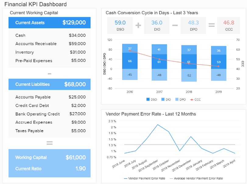
1. Financial KPI Dashboard
Finance is the beating heart of any business and creating a financial report is the basis for sustainable development. Companies need to keep a close eye on how their monetary operations perform and make sure their financial data is 100% accurate.
Our example focuses on metrics that are meticulously chosen to depict the general financial health of a company. The displayed information is presented in a logical order, connecting various financial indicators that make a complete data story, without the need to overcrowd the screen or complicate the report.
**click to enlarge**
Primary KPIs:
Working Capital
Quick Ratio / Acid Test
Cash Conversion Cycle
Vendor Payment Error Rate
Budget Variance
What data reporting is doing, in this case, is quite simple. Presenting the most important information in a clear financial narrative that will drive action. We can see in this financial dashboard that the company managed to decrease the cash cycle, but the vendor payment rate spiked in September last year. It might make sense to take action and see in more detail what happened so that the processes can be adjusted accordingly.
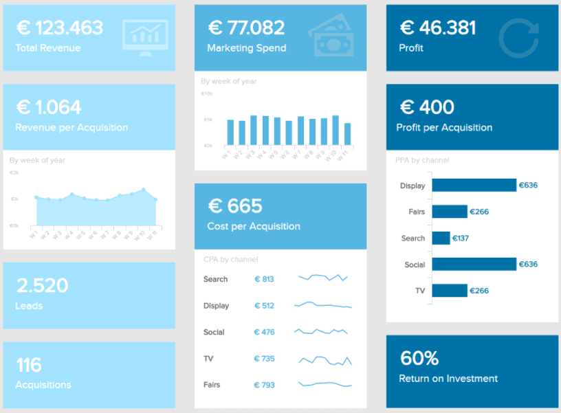
2. Marketing KPI Dashboard
Our next example is an intuitive marketing report composed of critical metrics related to costs and revenue. Marketers need to keep close track of this data as it helps them understand the success of their marketing efforts as well as find improvement opportunities to ensure a healthy marketing ROI.
**click to enlarge**
Primary KPIs:
Cost per Acquisition (CPA)
Customer Lifetime Value (CLTV)
Return on Investment (ROI)
With valuable coverage on revenue per acquisition, profit per acquisition, cost per acquisition, and more, this data report template provides a useful overview of the most important marketing indicators to make strategic decisions. For instance, by looking at the CPA by channel and campaign you can understand which of them are acquiring the most customers at the lowest price. In this case, we see that social media is the channel bringing the lowest cost per acquisition, and the highest profit, therefore it makes sense to invest more time and resources in it.
Aside from being a great tool to support efficient decision-making, the visual nature of the report makes it the perfect overview to show to your CEO or investors to prove the success of different marketing activities.
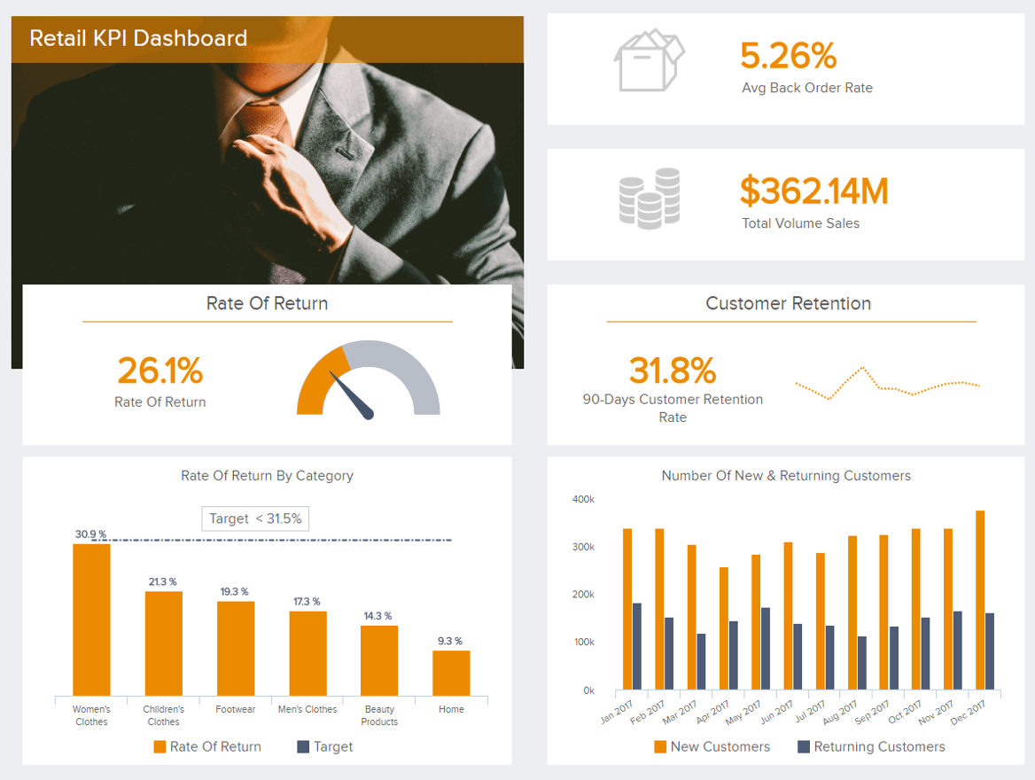
3. Retail KPI Dashboard
Retailers must be extra careful in picking the right metrics and presenting their data in a clear order, without cluttering the report or confusing the people that need to read it and act accordingly.
**click to enlarge**
Primary KPIs:
Back Order Rate
Rate of Return
Customer Retention
Total Volume of Sales
A retail dashboard such as the one presented above focuses on the perspective of orders which is one of the crucial points in this cutthroat business.
Gaining access to these touchpoints will equip you with the best possible ingredients to stay competitive in the market. Utilizing KPIs such as the rate of return (also by category), customer retention rate, and the number of new and returning customers will enable you to access in-depth information on your order processes and ensure your actions stay focused on developing your business on a sustainable level. For example, you can keep an eye on the rate of return and make sure it stays as low as possible. That way, your costs will be significantly lower and, ultimately, customers more satisfied.
Your retail analytics processes don’t need to foster complex reports, but with an example such as we presented above, you can see that reporting with dynamic visualizations empowers you to make better business decisions.
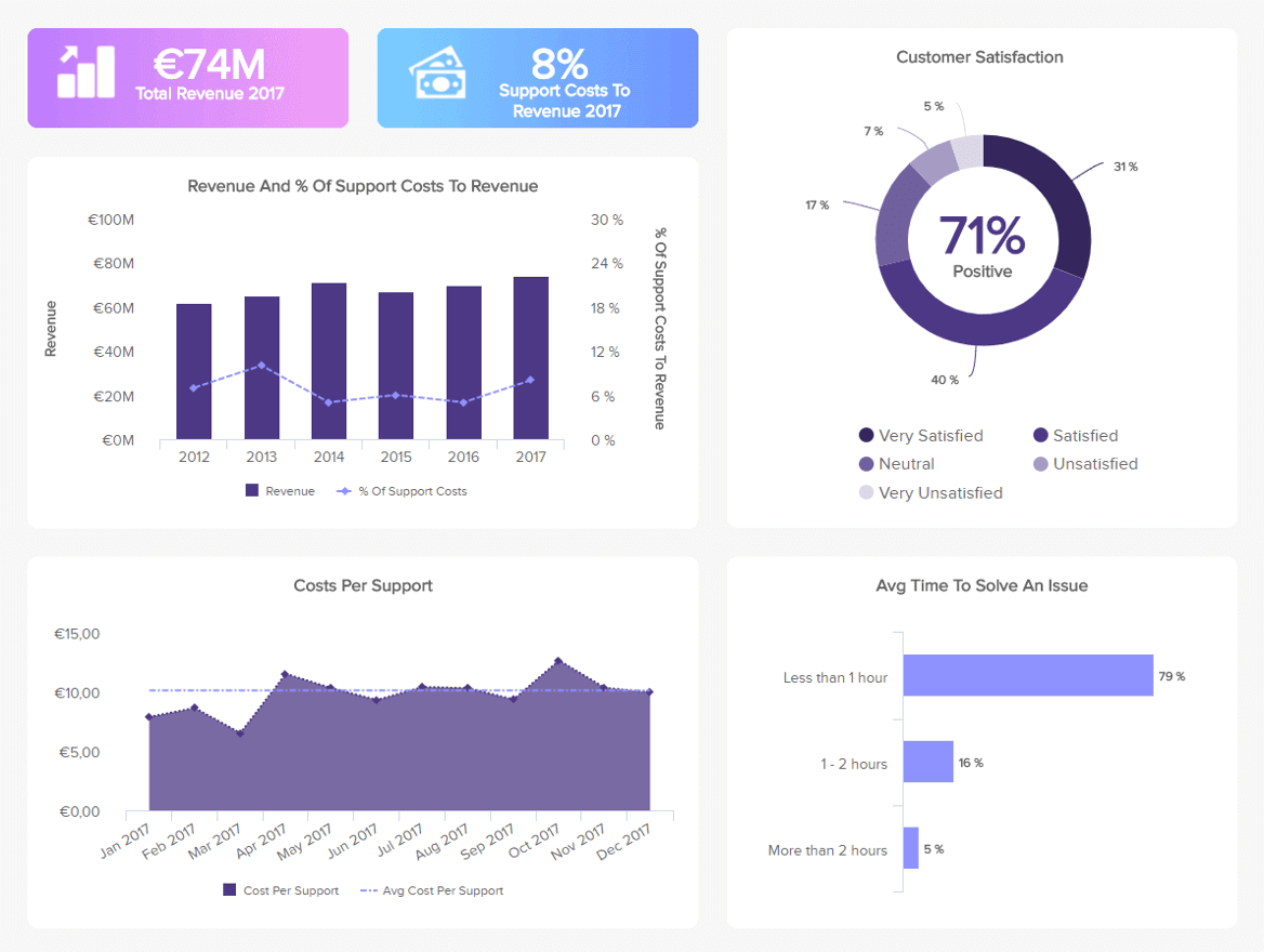
4. Customer Support Dashboard
Our next data report template is a customer service dashboard that offers a mix of metrics related to costs and revenue as well as customer satisfaction. With this information in hand, the support team can optimize their performance by finding improvement opportunities based on data.
**click to enlarge**
Primary KPIs:
Service Level
Support Costs vs Revenue
Customer Satisfaction
Although it might not seem like the most important area to invest in, your customer service experience can make or break your business. If clients are not happy with your problem-solving capabilities it is very likely that they will not come back to make another purchase. For this purpose, this report offers insights into revenue and costs as this helps you monitor that everything is running smoothly. For example, if you see that your revenue is going down and your costs are up, you need to think of solutions to make the service department profitable.
And not just that, this insightful report also offers insights into customer satisfaction and the average time your support agents spend in solving an issue. This can also give you insights into the general productivity of your team. If you see that the average time to solve an issue is rising then you can dig deeper into the reasons and find solutions to decrease it.
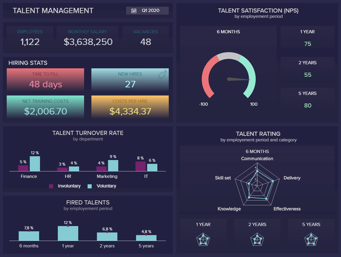
5. Talent Management Dashboard
The next of our data report examples is our HR dashboard focused on talent management. Talent retention and development is an ongoing challenge for HR managers. This data-centric reporting tool is designed to keep your top-performing staff engaged and motivated on a consistent basis.
**click to enlarge**
Primary KPIs:
Talent Satisfaction
Talent Rating
Talent Turnover Rate
Dismissal Rate
With a wealth of at-a-glance insights that are essential to successful talent management strategies and HR KPIs focused on the likes of rising talent as well as dismissal and turnover rates, this invaluable tool will prove vital to the health and growth of your organization. Moreover, your HR analytics efforts will prove to enhance hiring processes, enabling you to attract the best possible talent, automate tasks, and create a satisfying workforce environment.
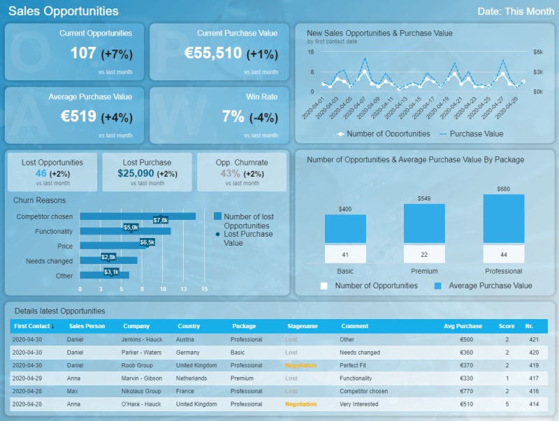
6. Sales Opportunity Dashboard
Sales are integral to the success of most companies. Our sales dashboard will help you identify revenue-boosting sources with ease while prioritizing them in order of prospective value.
**click to enlarge**
Primary KPIs:
Number of Sales Opportunities
Sales Opportunity Score
Average Purchase Value
This will allow you to streamline your sales strategy for maximum income, efficiency, and sustainability. This visually-balanced performance dashboard is easy to understand and will help you take direct action when it matters most – a priceless business intelligence tool for any forward-thinking organization.
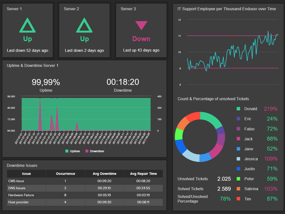
7. IT Issue Management Dashboard
IT analytics is another relevant area in which reporting data is useful. The IT department deals with a lot of information on a daily basis and this report helps them keep track of everything related to technical issue management.
**click to enlarge**
Primary KPIs:
Server Downtime
Meantime To Repair
Unsolved Tickets Per Employee
IT Support Employees per End Users
This insightful IT dashboard provides an overview of the most important metrics needed to ensure technical issues are resolved efficiently. First, we get an overview of the real-time status of three main servers alongside information on the last time they were down. This allows you to see at a glance if everything is going smoothly or if something needs immediate attention.
The data report template also offers information on the most common downtime issues which lets you find the root causes of recurring issues and prevent them from happening again. Paired with this, you get data about the performance of the different IT employees. As seen in the chart, 3 employees have a bad ratio of solved tickets compared to unsolved, meaning their amount of unsolved issues is much higher than the number of tickets they have solved. This can mean they are lacking training or maybe a specific issue is very hard to solve. The data gives you the opportunity to dig deeper into the reasons and improve efficiency.
8. Procurement Quality Dashboard
Our procurement dashboard is designed to streamline and fortify the relationship between you, your vendors, and your suppliers.
**click to enlarge**
Primary KPIs:
Supplier Quality Rating
Vendor Rejection Rate & Costs
Emergency Purchase Ratio
Purchases In Time & Budget
Spend Under Management
Cohesive procurement is vital to the financial and operational success of any modern organization, regardless of industry or sector. This interactive procurement report will help you quality-check your suppliers while digging deeper into metrics surrounding emergency purchases, rejection rates, costs, budgetary constraints, and more. A business-boosting tool that will form the backbone of your organization.
9. Hospital Performance Dashboard
From patient care to staff management, this insightful data report template for hospital performance is the perfect visual tool to ensure efficient facility management. More than any other industry, healthcare institutions can benefit from real-time data as it allows them to act immediately as soon as an issue arises – especially considering that any problems can affect the wellbeing of patients.
**click to enlarge**
Primary KPIs:
Average Hospital Stay
Hospital Readmission Rates
Costs By Payer
Armed with powerful healthcare KPIs, this data analysis report covers every relevant area to ensure the efficient functioning of the hospital. By using targets and desired outcomes to achieve, managers can find improvement opportunities on a clinical, operational, and financial level. For example, readmission rates are a metric that can directly affect your reputation as it is a token of the quality of care provided in your facilities, and should remain as low as possible.
Other pieces of relevant information this tool can provide are related to patients and staff. The nurse-to-patient ratio indicates how many nurses are available per patient, if you see that the number of patients is increasing during night shifts, then you need to make sure you have the right amount of staff working at those times.
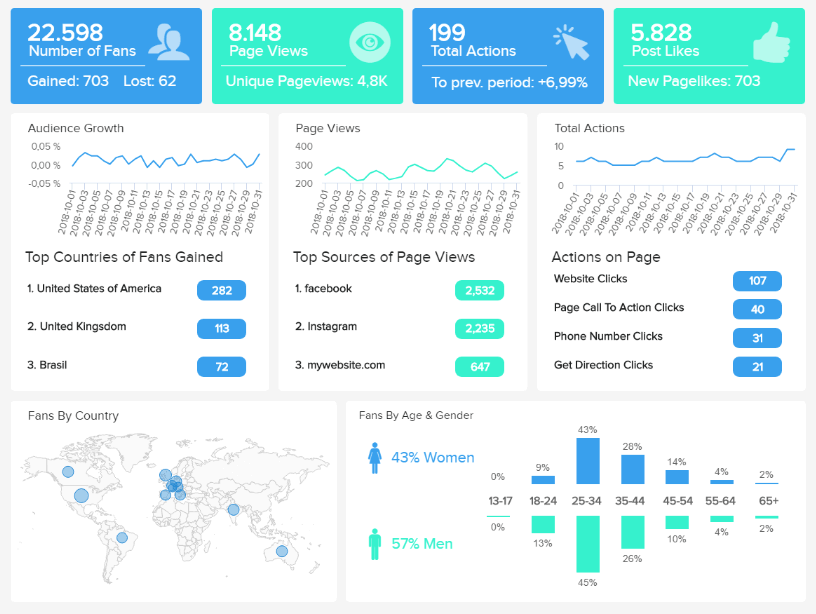
10. Facebook Page Dashboard
Last but not least, we have a social media report example for Facebook. With insights into page views, behaviors, interactions, followers demographics, likes, engagements, and more, this report provides all the needed information to optimize the growth of your Facebook page and ensure the success of your strategies.
**click to enlarge**
When creating social media campaigns understanding the behaviors of your target audience is crucial for success. Generating targeted experiences for your audience not only will make them more loyal to your brand but will also save you money and time on targeting the wrong people. For that purpose, this insightful Facebook dashboard is an invaluable tool.
Just like other social channels, Facebook has its own best practices and techniques to follow to ensure the best results from your organic, paid, and viral campaigns. While some of the metrics might seem purely informational, like the fans by country or gender, when mixed together they can provide deeper conclusions that will help generate interesting content and gain loyal followers in the process.
Primary KPIs:
Number of Fans
Follower Demographics
Page Views by Sources
Actions on Page
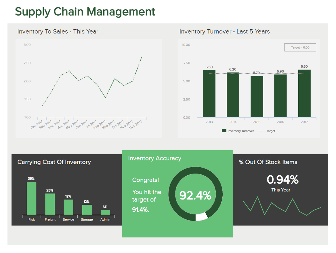
11. Supply Chain Management Dashboard
Your supply chain is one of the most important aspects of any modern organization. Optimizing every element of your supply chain will make your company more efficient while boosting your bottom line. Having an effective supply chain will also help you deliver on your customer-facing promises, which in turn, will build trust and accelerate your commercial growth.
**click to enlarge**
As one of our most visually grabbing data report examples, our supply chain logistics dashboard offers all of the metrics required to explore, examine, and improve every key aspect of your processes.
Here you can get a firm grip on your level of out-of-stock items while gaining a deeper understanding of overall inventory accuracy. You can also uncover key trends in your sales-to-inventory ratio as well as your inventory turnover.
By gaining access to this melting pot of visual information in one cohesive space, you can decide exactly where you need to rethink your inventory choices as well as your stocking, supply, and communication processes.
Working with this data report template regularly will empower you to take charge of your supply chain while remaining adaptable to consistent change. In turn, you will gain an all-important edge over the competition.
Primary metrics
Inventory Accuracy
Inventory Turnover
Inventory to Sales Ratio
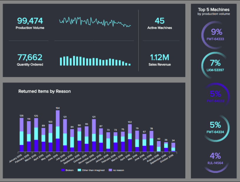
12. Manufacturing Production Dashboard
If you’re a business that deals in manufacturing, having the tools to track your various processes, respond to issues, and make informed development decisions is essential. Without a clear-cut vision, things can quickly spiral out of control, putting a significant dent in your budget as well as your brand reputation.
**click to enlarge**
This eye-catching data report example serves up critical manufacturing metrics, offering a panoramic snapshot of every important cog in the machine as a result.
Here you can drill down into your key production volumes over a specific timeframe while gaining a detailed glimpse into production costs as well as downtimes. Combined, these metrics will show you how efficiently your machines are working while finding a correlation between productivity and revenue.
This dynamic tool will also tell you which machines are the most efficient – which will help you better distribute your production output or volumes to make your strategy as efficient as possible across the board.
Working with this tool frequently will reduce unnecessary costs as well as long-winded processes while helping you nip any emerging issue in the bid before it gets out of control. The perfect manufacturing manager’s companion.
Primary metrics
Production Volume
Production Downtime
Production Cost
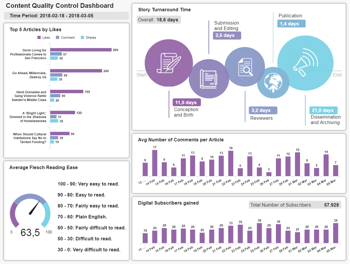
13. Content Quality Control Dashboard
In an age where the consumer is well and truly in control, content is the cornerstone of building trust, establishing brand authority, and standing out from the crowd. Without publishing consistently high-quality content that meets your audience’s needs across channels, you will get left in the commercial dust.
**click to enlarge**
A data report sample designed to keep your content marketing efforts consistently on track, this powerful reporting tool is packed with visuals that will elevate your brand to new heights.
Here you can use the Flesch reading test metric to gauge the accessibility of your content while pinpointing exactly which pieces of content are performing best across channels. This most dynamic of data analysis report examples will also show how many digital subscribers you’ve gained over a certain timeframe while exploring article engagement.
If you know what your consumers want or what they need in terms of informational value, you will skyrocket your company’s success – and you can do that with this content report.
This perfect storm of visual information will ultimately ensure that you’re producing the content that resonates most with specific segments of your audience while earning a consistently high return on investment (ROI) from your efforts.
Primary metrics
Flesch Reading Ease
Average Comments per Article
Story Turnaround Time
Start Building Your Data Reports Now!
We’ve answered the question ‘what is data reporting?’ and explored a host of powerful data reporting examples. During our journey, one thing has become clear: investing in the right analytical tools and processes will push your business ahead of the pack.
Now that you know how to create efficient data analysis reports, it’s time to embrace the power of modern BI solutions and data analytics.
Reporting, analytics, and smart informational processing can have a transformational impact on an organization if approached the right way.
Fortunately, the mind-numbing task of manually creating daily or weekly reports is a thing of the past. With the right plan and proper business reporting software, you can easily analyze your data and also create eye-catching and remarkable reports.
We are living in the age of information – a time when anything is possible. By embracing data-centric reports and forming the right foundations, you will accelerate the success of your organization in ways you never thought possible, pushing you ahead of the pack in the process.
All you need to do is follow these essential steps and recommendations, and you will be on your way to a brighter, more prosperous commercial future. If you want to start creating your own powerful and modern reports and testing all of these practices, you can try datapine for a 14-day trial, completely free. The time to strike is now.